Redesigning emergency medical ID onboarding to build trust with families before asking for sensitive medical details.
Vitals provides first responders with instant, non-verbal medical profiles during emergencies. Yet despite strong demand from families, 92% of new signups abandoned the onboarding flow before completing their profile.
TIMELINE
14 Weeks
MY ROLE
Lead Product Designer
COLLABORATION
Executive Team & Medical Advisors
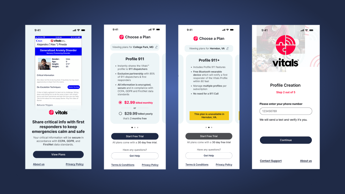
The redesigned onboarding sequence establishes emergency responder visibility and local coverage before asking for sensitive medical details.
01 / The Emergency Context
Giving first responders critical context before arriving on scene.
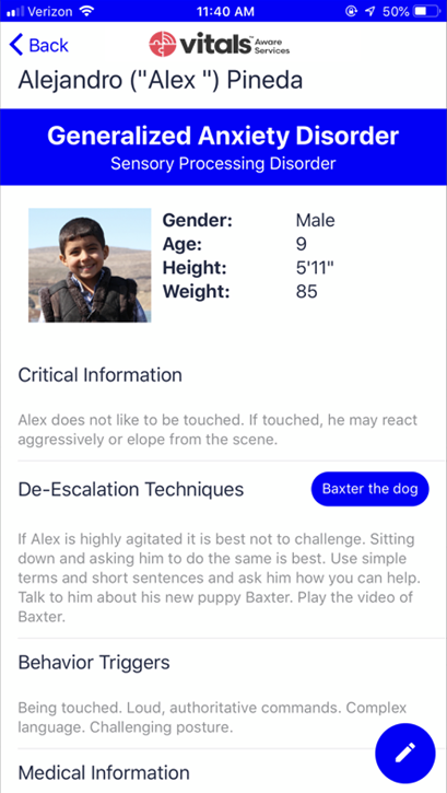
Vitals gives first responders quick access to medical profiles and de-escalation tips during an emergency. Instead of relying on verbal questioning during a crisis, officers and medics see calming strategies, behavioral triggers, and emergency contacts before approaching.
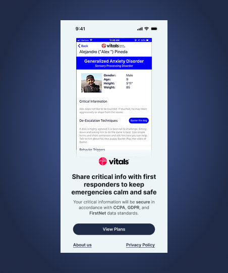
The emergency profile displays de-escalation notes, sensory sensitivities, and emergency contacts directly to dispatched responders.
02 / The Operational Barrier
92%
INITIAL ONBOARDING ABANDONMENT
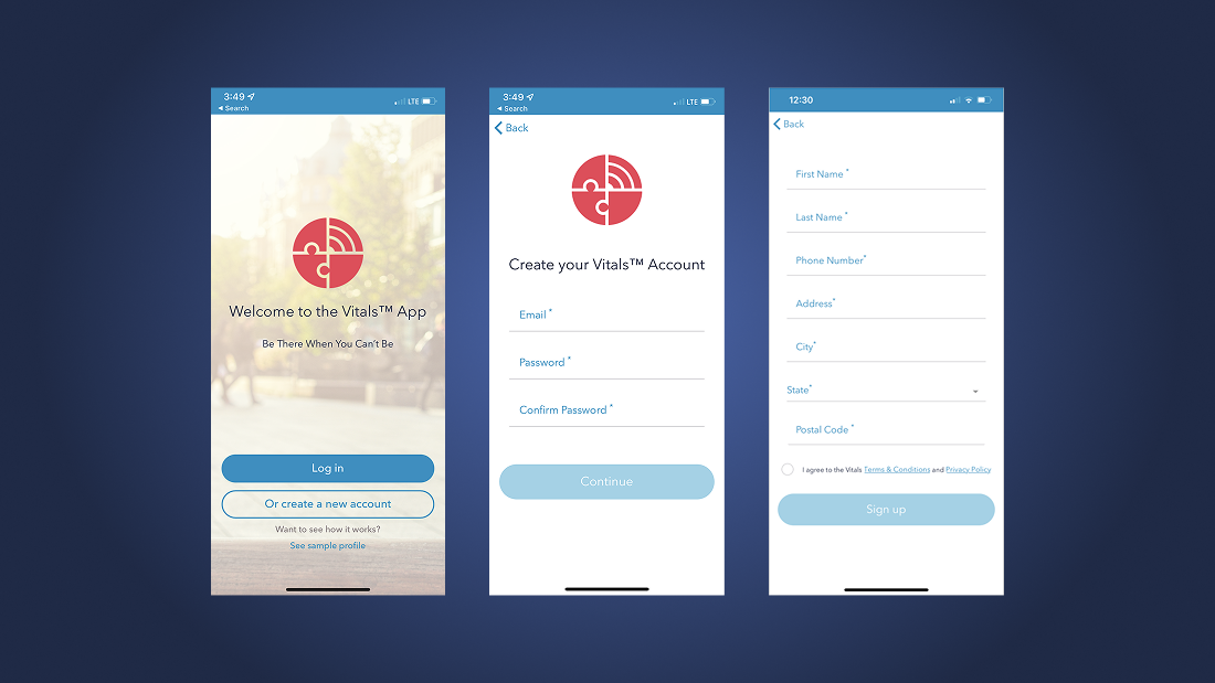
The original signup treated onboarding like an administrative form. It demanded medical diagnoses and paid subscriptions upfront, before ever explaining who could view the data or how it would be protected.
03 / What We Learned from Users
Diagnosing why 92% of users left without subscribing.
Analytics showed where people left, but interviews with caregivers revealed why. Families were not intimidated by the length of the form. They hesitated because they were being asked for intimate diagnoses without knowing whether their local police department or 911 dispatch even supported the service.
DIAGNOSTIC 01
Premature personal questions broke trust
70%DISCLOSURE RESISTANCE
Seven out of ten caregivers we interviewed hesitated to share neurological conditions, medications, or behavioral triggers before understanding who could see that data and how it was kept secure.
“Why do you need my daughter’s diagnosis before you’ve even shown me how a police officer will see it?”
The original sign-up flow demanded intimate medical diagnoses immediately after registration, before establishing responder protocols.
DIAGNOSTIC 02
Uncertainty around local coverage
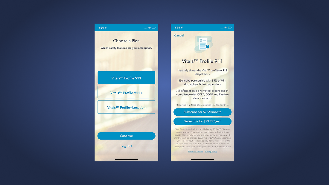
The pricing step showed abstract plan tiers without confirming whether local emergency services in the user's city actually used Vitals. Families worried about paying for a service their local police or paramedics could not scan.
“I don't know what 'Standard Statewide' vs 'Regional' means if my dad travels across state lines.”
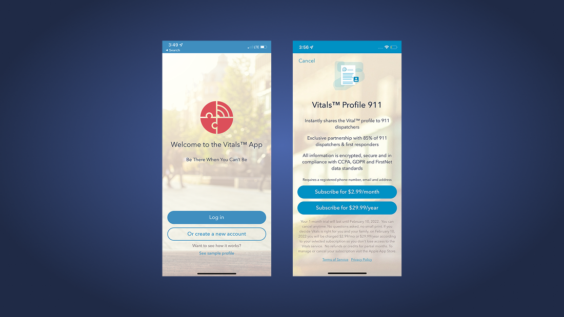
The legacy pricing screen forced users to choose statewide vs. regional plans without confirming whether local responders supported the beacon.
DIAGNOSTIC 03
Trial terms and cancellation policies were buried
Key reassurances like the 30-day trial, sample profile previews, and the cancel-anytime policy were pushed into small text below the fold. Users assumed they were committing immediately to a recurring subscription with no way out.
The legacy pricing screen pushed trial terms and cancellation policies below the fold, creating unnecessary anxiety around payment.
DESIGN PRINCIPLE
“When you ask a family for their child’s medical history, trust isn’t about visual polish. It comes from answering two basic questions: who sees this, and will it help when there is an emergency?”
Trust First · Transparent Plans · Clear Questions
04 / The Redesigned Experience
Inverting the funnel: trust before disclosure.
I restructured the flow so families see how responders use the service, confirm local coverage, and choose a plan before being asked for private health information.
INTERVENTION 01
Showing how first responders see the profile
Before asking for credentials or account details, the welcome screen demonstrates exactly how police and paramedics view a profile during an incident. Families see a clear preview of what information is shared, setting clear expectations from the first screen.
Caregivers preview exactly what first responders will see during a call, removing ambiguity around data access.
INTERVENTION 02
Checking local coverage before choosing a plan
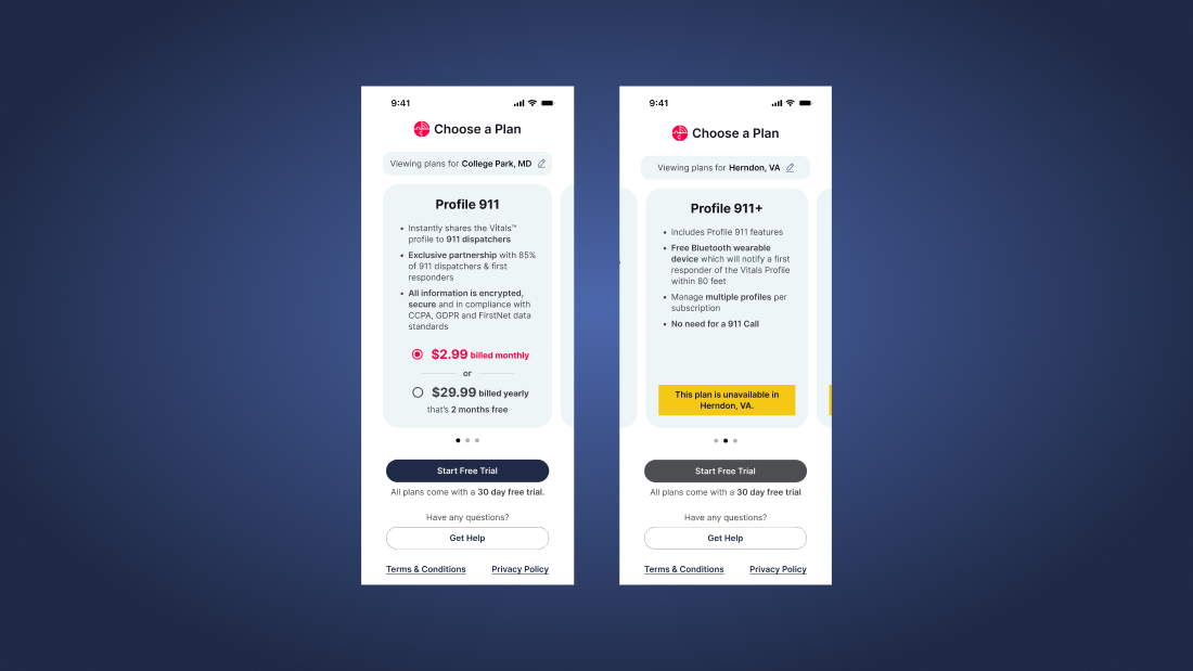
Instead of presenting confusing plan names, the interface starts with a zip code lookup to confirm local 911 and police participation. Once coverage is verified, plan tiers show regional versus statewide options with trial terms and cancellation policies stated plainly alongside the pricing.
Zip-code verification confirms active first-responder partnerships before users commit to a subscription.
INTERVENTION 03
One question at a time with clear context
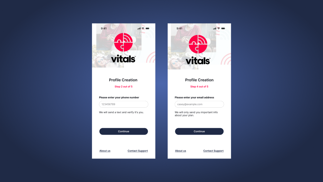
I broke the long registration form into focused, single-question steps. Each screen explains why a specific field is needed. For example, it clarifies that a phone number is used for urgent verification rather than marketing, removing second-guessing during intake.
Single-question progressive disclosure cards explain why each data field is needed and who is authorized to view it.
INTERVENTION 04
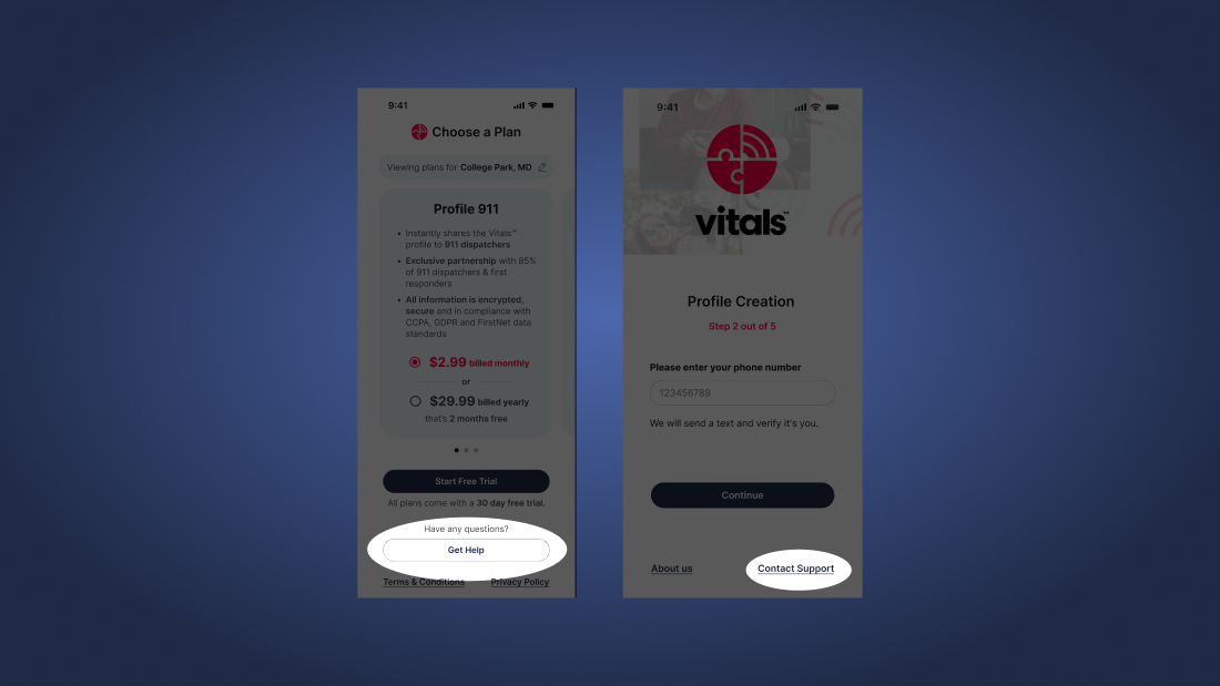
Contextual help on every screen
Help options are directly accessible on each screen so users can ask questions or confirm details without losing their place or exiting the onboarding flow.
Persistent 'Get Help' and 'Contact Support' actions allow caregivers to resolve questions without losing their progress.
05 / Projected Outcome
+16%
PROJECTED CONVERSION LIFT
Verifying 911 coverage and clarifying how responder profiles work before requesting medical data resolved the main hesitation point, leading to an estimated 16% lift in profile completions.